Are you a yoga instructor willing to build a yoga website that caters to user-flexibility?
While it’s efficient enough to manage your clients using an appointment scheduler, building a website allows you to establish your brand identity, promote professionalism, and let visitors find you easily, anytime, from anywhere.
Well, it might seem confusing what you can incorporate into your yoga websites. However, getting inspiration from the market can help you brainstorm your thoughts and improve more
So, let’s get introduced to some of the best yoga instructor website examples—
Table of Contents
Discover the Best Yoga Instructor Website Examples
1. Dr. Anna Roth

Dr Anna Roth’s best yoga website examples instantly greet her site visitors with a pop-up that offers a free PDF resource to the visitors after a subscription. This is a very effective marketing strategy for businesses if you want to collect sales leads using a pop-up builder.
Additionally, Anna focuses on website content. By keeping the color scheme in beige and green, she utilizes large black and bold fonts to make her words pop out!
2. Daniel Rama Yoga
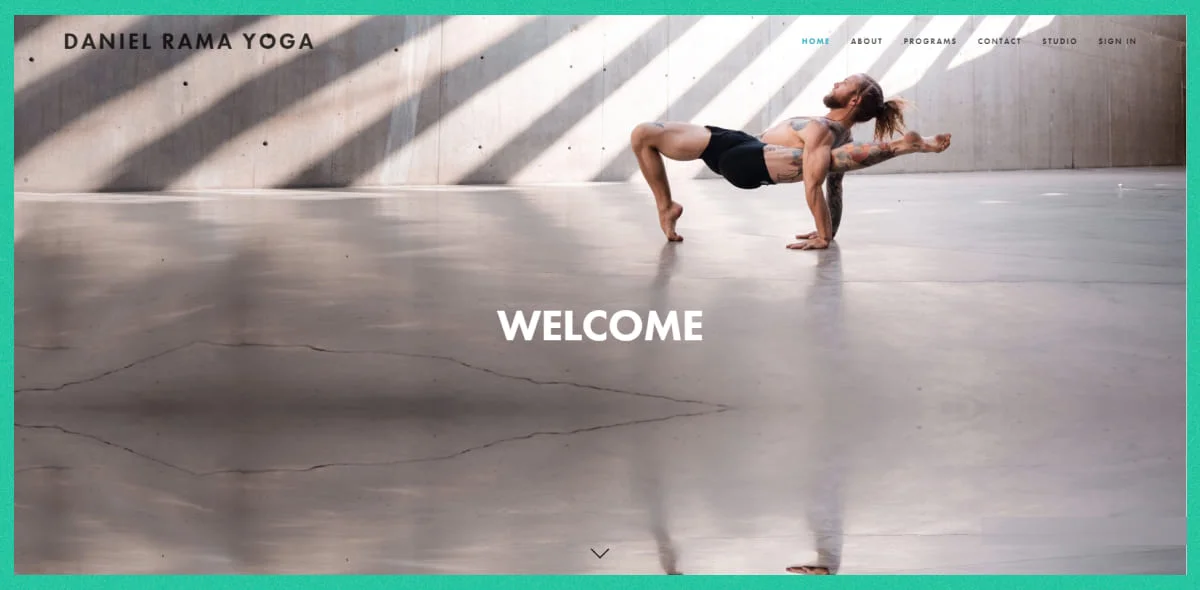
Daniel Rama’s yoga instructor website example is a feature-rich platform where you have all the details to know about the instructor, his works, and even his past clients.
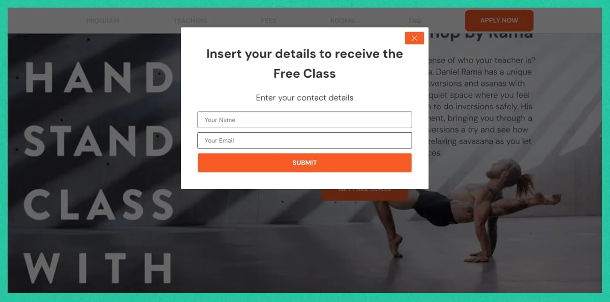
The website focuses on incorporating high-quality visuals with short-descriptive texts that gives you a clear understanding about the site and. In his website ‘Studio page’ he leveraged an online scheduling form to amble online appointment booking for people who want to join the team remotely!
3. Lila Lolling

Lila Lolling’s yoga website not only focuses on helping people but also serving the planet earth. Her yoga lessons are a wise source to educate people and connect more mindful souls who want to change the environment.
With a motto of ‘yoga is a climate action,’ Lila introduces her visitors to Yoga movements and their benefits for nature. On the website footer, she anchors her Events Booking page, which includes event details, location, duration, and an online appointment reservation system.
4. Yoga By Nina

Nina’s yoga instructor website example is a platform ‘Where 21st Century technology and ancient practices of yoga and meditation come together to take you on an experiential journey through the senses, exploring self.’ –Yes, this is how this expert K-pop artist explains her yoga site.
Check out the use of parallax-scrolling animation throughout the entire site. With the use of whitespace and minimalist web design trends, the content and calls-to-action buttons would capture your attention. Students can also book both one-to-one and one-to-many meetings using its appointment scheduling system.
5. Yoga in Demun
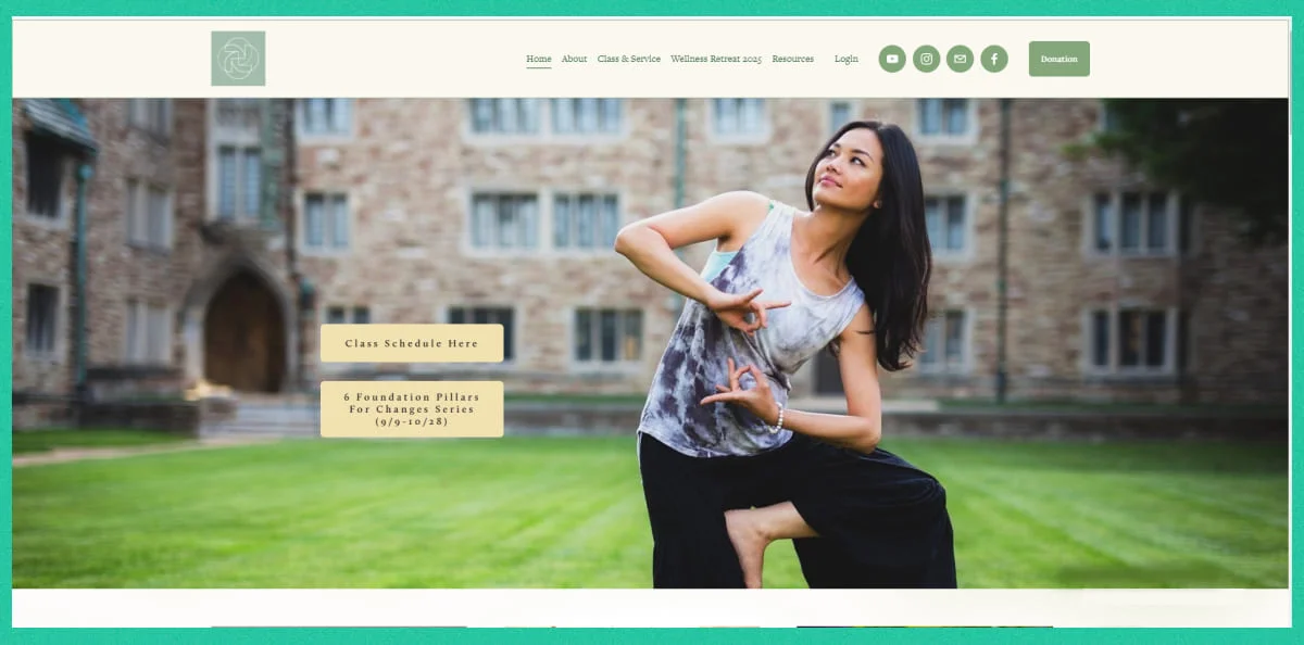
Straight to the point, the yoga website of Demun has brought the focus on the very beginning of its website design.
The teacher’s attention to detail in choosing a high-contrast color-scheme, with a simple and light font style is all you need to scroll-down through it. The wide, cluttered photo gallery will help her visitors have a glance of the available classes. She also anchored different resource pages like- booking page, yoga tips, and her other services so visitors could learn about each of the highlighted items without any hassle.
6. Stephanie Snyder
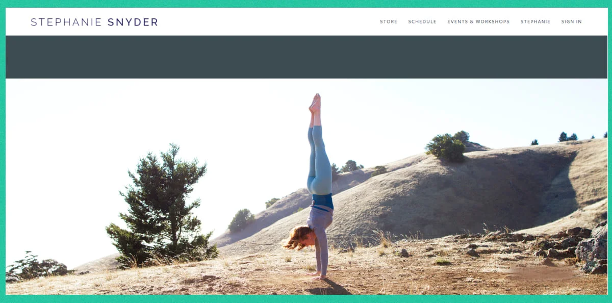
Stephenie is a long time content creator with over 25 years of experience. She is also the founder of yoga websites love story yoga where she and her team teach yoga lessons, arrange webinars and training sessions.
With an amazing story-telling journey, Stephanie also utilized various types of yoga movement images throughout almost every page of the site. It is a great practice to build brand recognition and make visitors trust your business. You can also incorporate user testimonials like this yoga teacher did to insist visitors turn their interest into a buying decision!
7. AsanaVanessa
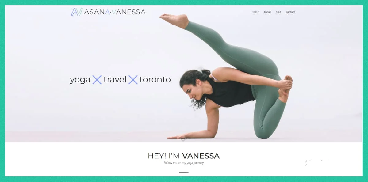
Apart from many other yoga website examples, Vanessa’s high-visual site stands as the most attractive, easy-to-navigate, clean platform. Anyone can easily access her content without any dilly-dallying.
On her yoga websites, Vanessa focuses on converting her target audiences in the shortest time possible. Right after her hero section, she introduces the visitors with the yoga lessons. Besides she anchored one of her YouTube videos to this section making it a more powerful way of building brand identity.
8. Shala Living Yoga
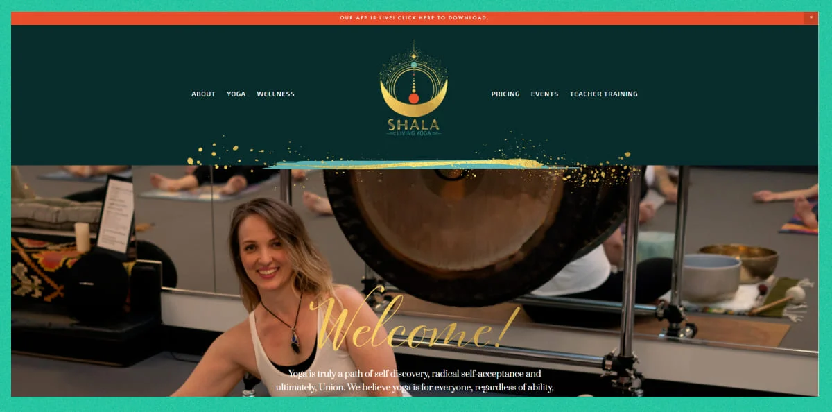
Located in eastern Washington, Shala Living Yoga is a yoga academy website that offers both in-person classes and virtual classes. What you would find to be an amazing marketing strategy is that even after having costly pricing packages, they highlighted only the cheapest one, which is only $49 for 30 days.
Anchoring the important resources in different categories—childcare, Gallery, FAQ, on-demand, and a booking page—Shala ensures that their platform stands out the best for all yoga enthusiasts.
9. Toronto Yoga Co.
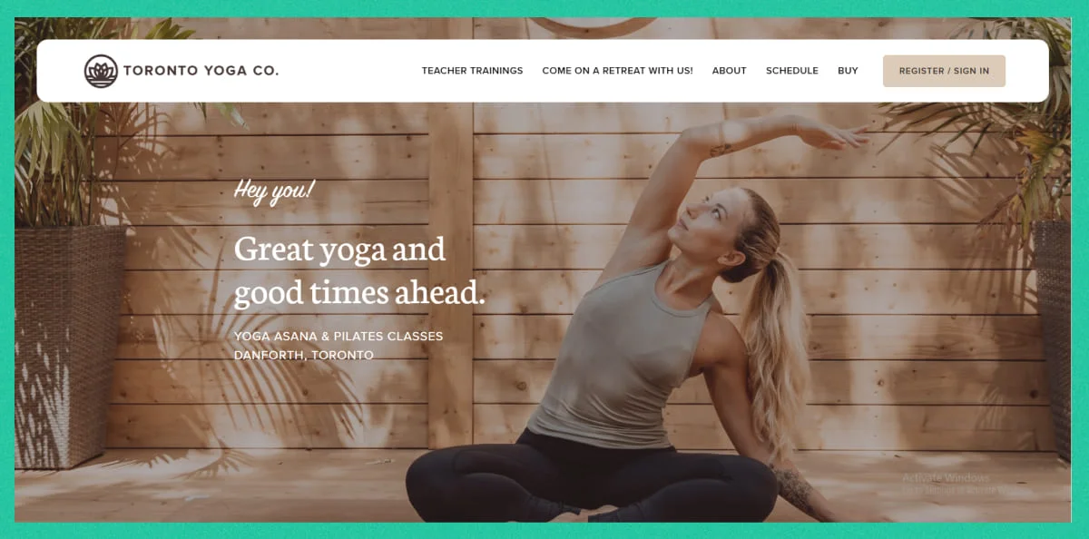
Yoga teachers of this amazing yoga company know what their customers look for: a group of different yoga and pilates classes, yoga-supporting products, online events via Zoom, a fine Google map view, and scholarships! Apparently, all these unique features are listed in the site navigation bar that works just without any errors!
10. One Yoga
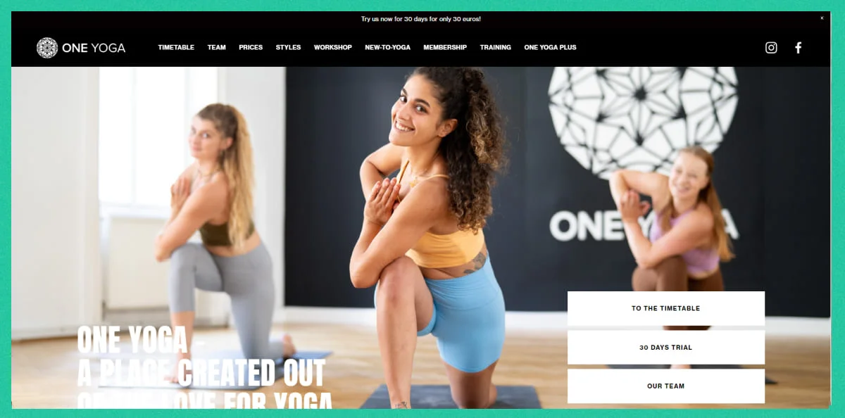
One Yoga has beautiful yoga websites incorporated with a real-time calendar view of every yoga lesson timetable. Anyone can simply have a sneak peek of the upcoming lessons online while doing their personal work. It’s efficient, customer-friendly, and connects your yoga websites!
Besides, their well-functional workshop page makes it easy for potential clients to find the right movement that suits their needs without any guesswork. Even if anyone wants to stay connected through other ways, can easily follow them on social media, where Shala shares all-time updates and highlights regularly!
11. SUKHA YOGA
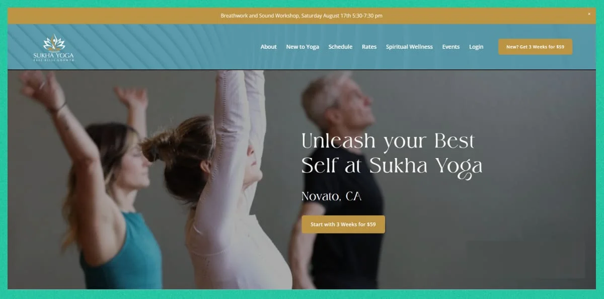
If you want to bring more clicks to your yoga website examples, then this online presence is worth mentioning that leverages attracting calls-to-action buttons in every part of the website.
To attract target audiences’ attention to the website elements, they leveraged different patterns and color contrasts. This is an effective practice for increasing customer engagement and creating a lasting impression in visitors’ minds.
The 6 Key Elements of a Yoga Website You Should Not Miss Out
Throughout the discussion, I have discussed many features and information you can keep on your artist’s website.
But, there are some features that you should not miss out on while building a yoga booking site. Let’s give it a shot—
- Booking Page/Form: Make sure your website contains a booking page or form that allows students to book your courses online. This is a must if you want to drive more clients using your yoga website!
- Testimonials: Testimonials works effectively to build visitors trust, includes real-life proofs and works as the best proven method of converting visitors into paying customers.
- Social media integrations: You can reach more customers from social media platforms like Facebook, Pinterest, and LinkedIn and boost sales without spending more. It gives you the most profitable way to monetize your site.
- Course Pricing: When a visitor visits your works and testimonials and becomes interested in knowing more– this is when they want to know the pricing of your courses. Make it easy for them to see the course details and compare the plans. It is fast-converting to letting them contact your business and wait for package details!
- Online Payment System: Make it simpler, easier, and faster for clients to book appointments by offering online payment methods. You can make the most out of your yoga.
- Online Schedule/ Reschedule feature: Allowing online scheduling and rescheduling appointment option increase customer satisfaction.
Whether you are building a non-profit or sales focused yoga teacher website, adding these key elements is a must. And luckily, best appointment schedulers like Timetics AI include all these features with more robust user functionalities.
Even, you don’t need to have a fully-fledged platform to start selling with your yoga website ideas. Instead, you can simply create a virtual booking page with Timetics appointment scheduler, share it with the client’s inbox on your social platforms, and even anchor it anywhere on your site.
Without the use of any third-party solutions, Timetics will allow you to host online and offline yoga lessons, events, collect payments, and even get event reports all inside your dashboard. It’s easy-to-use, feature-rich, and accessible for all!
Learn how appointment schedulers like Timetics AI can boost your events!
Bring More Sales to Your Yoga Websites with Timetics AI
Creating a highly converting yoga website involves more than just a visually appealing design. It requires compelling web copy, a strategic use of colors, and a well-structured layout. Though it takes effort, the results are worth it when you start seeing tangible outcomes.
As you draw inspiration from the top yoga teacher website examples we’ve discussed, remember that functionality is key. It’s important to build a site that is well-functional with other mandatory solutions like online booking software cause it’s how you turn visitors into customers and drive sales growth.


