Meeting Appearance controls how your booking page looks to the person making a booking.
It includes the feature image or video shown at the top of the page, your brand colour, and the default layout customers use to browse available dates and times.
Appearance settings are managed in three places:
- Appearance Setup: Calendar-specific feature media and booking layout.
- Settings → Appearance: Workspace-wide branding, profile image, cover image, brand colour, and default booking layout.
- Page Builder: A drag-and-drop editor for changing the structure and design of your public profile and booking pages.
Why Do You Need It?
- Create a branded and professional booking experience with your logo, colour, image, or video.
- Choose the right layout—Month, Week, or Day—for your appointments.
- Keep your branding consistent across calendars and your public profile.
- Customize your booking and profile pages with the Page Builder.
Prerequisites
- Calendar update permission to manage Appearance Setup.
- Settings update permission to manage Settings → Appearance.
- A plan with Custom Branding to hide Timetics branding.
- A plan with Page Builder to customize pages with the Page Builder.
Calendar-Wise Appearance Settings
Step 1: Open the Appearance Setup Tab
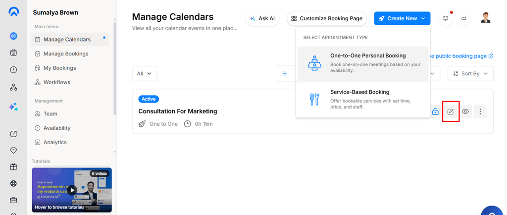
Go to Dashboard → Manage Calendars, open the calendar you want to customize, and select Appearance Setup from the left rail.
Appearance Setup is available for both One-to-One and Service-based calendars.
Step 2: Add a Feature Image or Video
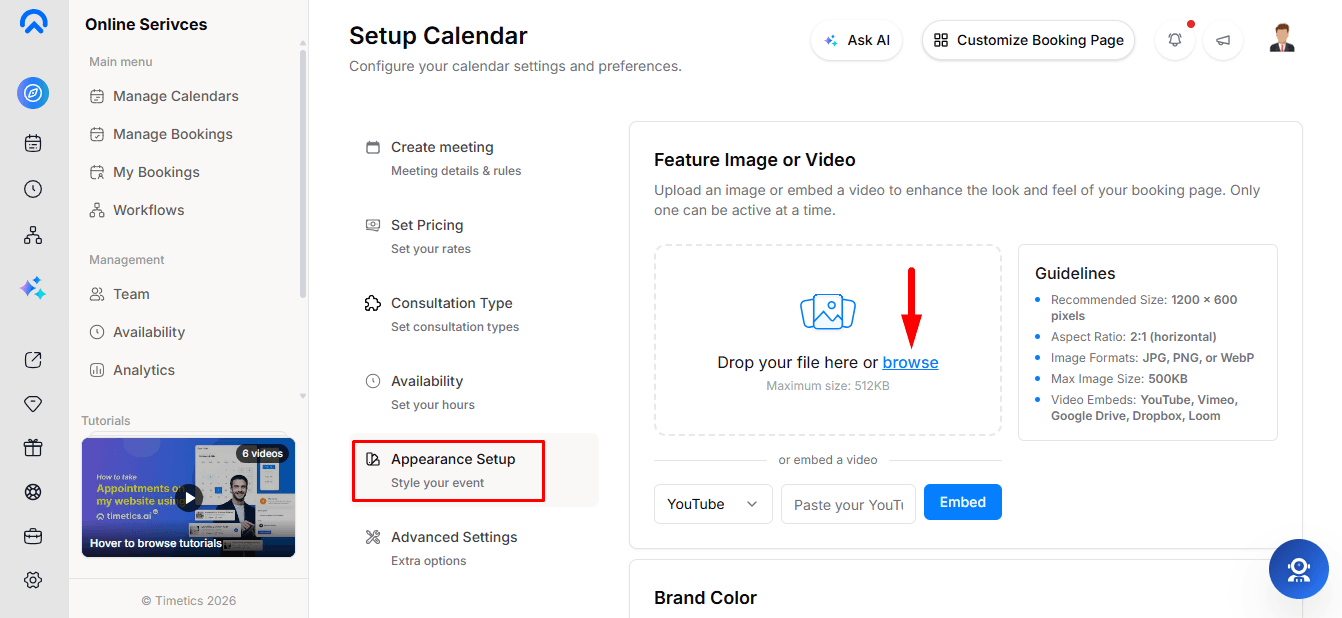
Add a Feature Image or Feature Video to display at the top of your booking page. You can use only one at a time—adding one replaces the other.
Feature Image
- Recommended size: 1200 × 600 px (2:1)
- Format: JPG, PNG, WebP
- Maximum size: 500 KB
Feature Video
Paste a video link from YouTube, Vimeo, Google Drive, Dropbox, or Loom. Timetics automatically detects the supported platform.
You can delete an existing image or video with a confirmation step.
Step 3: Choose Your Brand Colour
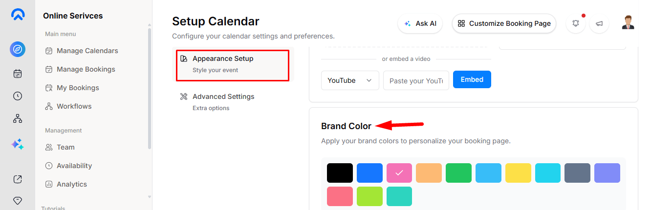
Open the Brand Color card and choose from the 13 available colour swatches. The change saves immediately, and the selected colour is used across public-facing elements such as buttons, selected dates, links, and highlights.
Step 4: Choose the Booking Layout
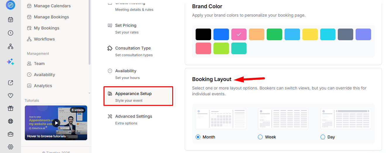
The Booking Layout determines how customers initially view available dates and times.
Choose Month, Week, or Day based on how your appointments are usually booked. The selected layout is saved per calendar, while customers can still switch between the three views on the booking page.
Workspace-Wise Appearance Settings
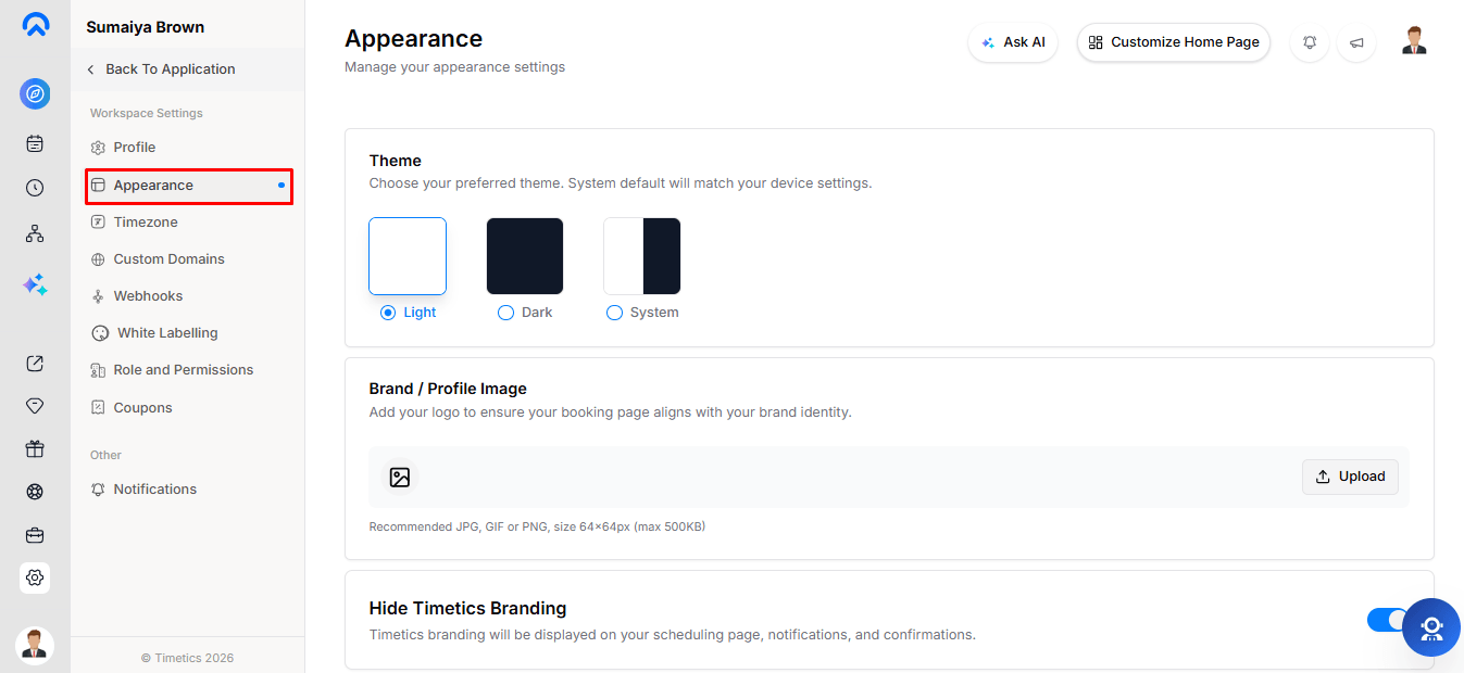
Go to Settings → Appearance to manage workspace-wide appearance and branding.
- Theme: Light, Dark, or Device for your dashboard only.
- Brand / Profile Image: Your logo or profile image. 64 × 64 px, JPG/GIF/PNG, max 500 KB.
- Hide Timetics Branding: Removes Timetics branding from scheduling pages, notifications, and confirmations. Requires Custom Branding.
- Brand Color: Sets the primary colour for public pages.
- Cover Image: Banner for your public profile. 1920 × 260 px, max 500 KB. Calendar pages use their own Feature Image or Video.
- Booking Layout: Default layout for calendars without a custom layout.
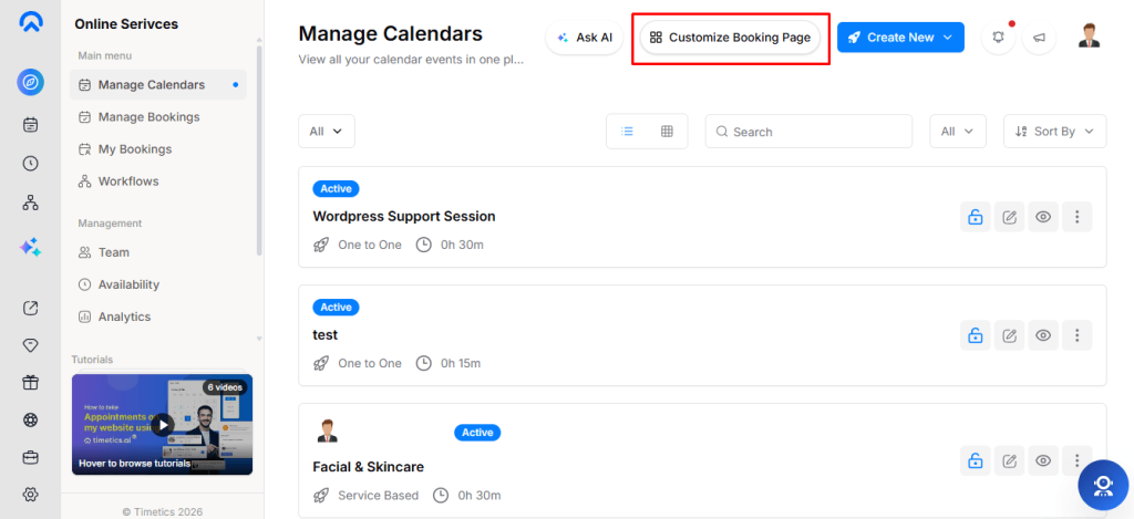
Customize Your Page with Page Builder
Use the Page Builder to customize your public pages:
- Home Page: Customize your public profile page.
- Booking Page: Customize a specific calendar’s booking page. Select the calendar from the top-bar dropdown.
- Elements: Add headings, hero sections, text, images, videos, testimonials, FAQs, CTAs, columns, spacers, and dividers.
- Responsive Preview: Preview your page on desktop, tablet, and mobile.
- Theme Options: Choose from available colour presets and themes.
- Save & Publish: Changes are autosaved as drafts and become public after clicking Publish.
Note: Page Builder requires a plan that includes this feature.
Frequently Asked Questions
1. Can I add both a Feature Image and Video to a calendar?
No. You can use only one at a time. Adding one replaces the other.
2. Can I use different Feature Images for different calendars?
Yes. Each calendar can have its own Feature Image or Video.
3. Does changing the Brand Color affect all calendars?
Yes. Brand Color is workspace-wide and applies across your public pages.
4. Can customers change the Booking Layout?
Yes. The selected layout is only the initial view. Customers can switch between Month, Week, and Day.
5. Can I customize the booking page beyond these settings?
Yes. Use the Page Builder to customize the structure and content of your public pages.
6. Does the Cover Image appear on calendar booking pages?
No. The Cover Image is displayed only on your public profile page. Calendar pages use their own Feature Image or Video.
Conclusion
With Meeting Appearance, you can easily personalize your booking experience with images, videos, branding, layouts, and custom page designs. Use Appearance Setup for individual calendars, Settings → Appearance for workspace-wide settings, and Page Builder for advanced customization.